
When it comes to documenting projects, it is challenging to know where to start. It is challenging finding the first few words. After the first few words, it gets slightly easier until the next full stop. You pause. You think of something else to write. You write it and then pause again. You've now written a few things down, but how do they relate? Should the reader somehow be steered around this information? And how should you organise this information?
This post describes 'Documentation Quadrants', which help solve two problems:
- reader confusion-poor documentation causes readers frustration - they either do not read it, or use something else with better documentation
- author confusion—not knowing how to create good initial documentation or cleanly extend the documentation as the project/product evolves
Documentation Quadrants help to solve these problems. It breaks down documentation—which has traditionally been thought of as one thing - into quadrants - four things—or four modes:
- tutorials
- how-to guides
- discussions
- reference
Documentation Quadrants are sometimes called Diátaxis (no, it’s not a name for a bad cab company)
The name Diátaxis comes from the Ancient Greek δῐᾰ́τᾰξῐς: dia (“across”) and taxis (“arrangement”)
That description is important—the items in the quadrant are important on their own, but the relationship between them - the axes / arrangement - is equally important.
In this post, I'll describe what I learnt about Documentation Quadrants. and then describe how I applied it in my open-source project.
This isn’t an in-depth description. Instead, I'll give an overview of what I learnt and then give links for further reading.
Overview #
Documentation Quadrants have two axes. The first relates to the kind of information-practical or theoretical.
The second relates to context in which the information is used-studying or working.
These quadrants classify different documentation artifacts:
- tutorials
- how-to guides
- discussions
- reference
As the old saying goes, a picture is worth four quadrants:
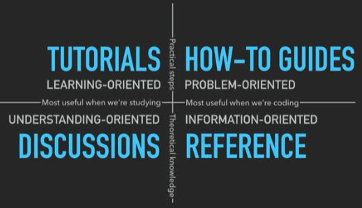
taken from the excellent video from Daniele Procida - references at the end of this post
There is quite a bit of information in that picture. A very brief description follows, with a slightly more in-depth description a bit further down:
- tutorials—taking the reader to a meaningful end goal that you decide they need to know
- how-to guides—answering questions that only someone with some experience would have
- reference—technical descriptions which do not attempt to explain concepts or achieve tasks
- discussions—explanations for clarifying a particular topic
Just as important as the four quadrants, are the axes. Going clockwise, we have:
- top left to top right - tutorials and how-to guides describe practical steps
- top right to bottom right - how-to guides and reference are most useful when users are working with your product
- bottom right to bottom left - reference guides and discussions are concerned with theoretical knowledge
- bottom left to top left - discussions and tutorials are used when studying rather than working
They key phrases here, again, going clockwise from the top left, are:
- learning-oriented—the user is learning new things
- problem-oriented—the user knows enough that they can identify a problem that needs solving
- information-oriented—the users want specific information
- understanding-oriented-the user is gaining understanding that underpins further learning
Learning? Understanding? #
As I read about these concepts, it all sounded a bit wishy-washy. My immediate question was around the differences between ‘understanding-oriented’ and ‘learning-oriented.’
I learnt that Understanding-oriented is where the author clarifies and illuminates a particular topic.
Learning-oriented **is where the author takes the reader though a series of practical steps to complete a task.
The differences between How-to guides and Tutorials also confused me.
Tutorials-take the reader through steps to achieve something. It is not particularly important what is achieved; more important is that the reader is in a particular environment and hearing about common terms and phrases.
How-to guides-are for when the reader has enough information that they need to solve a practical issue.
The divio pages elegantly clarifies this with the analogy of teaching a child to cook. For instance, for tutorials, what you teach a child to cook isn’t important. What's important is that the child is in a kitchen environment and gaining practical experience of using utensils and handling food. Whereas how-to guides are akin to recipes. A recipe has a clear, defined end and addresses a specific question. It would probably be unreasonable to expect someone to follow a recipe if they have no kitchen experience.
Understanding-oriented means the users don’t know what they don’t know. They cannot yet formulate the questions because they lack the understanding
Information-oriented is where the user does have enough understanding to formulate a question, and they seek the required information on a particular topic. Hopefully your document has that information!
This was probably one of the biggest takeaways for me. Understanding this difference caused a light-bulb to come on in my head. And when it came on, it illuminated areas where I had confused these two things in everything I've ever documented (and likely confused all of the readers of that documentation!)
Collapse! #
This quote in the divio pages struck a chord with me:
The tendency to collapse
Up until now, when I did technical documentation, I always felt that it wasn't quite organised enough. I tried to organise it, but it never felt like the correct way.
For instance, I'd start out by describing an idea, and then show the code, and then drill down into details of the code. In my mind, it was organised: it was all related, and so keeping it close together was the natural thing to do.
What I was doing, and I only now realise, was mixing up the discussions, reference, how-to, and tutorials into one. The diagram from the divio page was extremely accurate!
The Quadrants #
So that was a brief overview of the layout and the quadrants. Let’s go into slightly more detail on the quadrants:
Tutorials #
Takes the reader through a series of steps to complete a particular task. The task is something that you decide. Once the reader has finished a tutorial, they can better understand the rest of the documentation and have a better understanding of the overall project. By finishing a tutorial successfully, they can feel a sense of accomplishment.
Tutorials should:
- be concrete, not abstract—they're for the specific, not the general
- only explain what absolutely matters-explanation doesn't matter when someone is learning a new skill
- no distractions-don’t give options or choices—you decide what the user will do and what the outcomes are going to be
How-to Guides #
Provides detailed instructions on how to use the project to solve a particular problem. They address a question: “How do I do …”
Examples are “How to validate user input” or “How to write instances to a database”
A guide should cover all essential tasks and processes, as well as any troubleshooting tips, and also include examples of how the project can be used.
You can assume that a user has enough basic knowledge that you do not need to repeat anything provided in the tutorials.
How-to guides don’t have to start at the beginning. Going back to divio's cooking analogy: a how-to is a recipe, and for a recipe, you don’t need to tell the user to wash their hands as you would do in a tutorial on how to cook.
How-to guides are commonly mixed up with tutorials. How-to guides don’t have to be as bullet-proof as tutorials; if you miss something minor in a how-to, then it shouldn't derail anything as missing something in a tutorial.
Naming is also important in a how-to. The preceding example “How to validate user input” would mean far less if it was just called “Validation”
Reference #
Provides a comprehensive list of all the components in the project. This includes all APIs, classes, libraries, databases, and any other relevant resources. This quadrant should also include links to the project's source code and documentation.
A reader coming to this section has likely read and understood the tutorials and how-to guides and are looking for more detailed information.
Therefore, this section should be simple and to the point. It isn’t the place to describe basic concepts or take the reader through steps to achieve something. But it can include examples as long as it doesn't go on to describe basic concepts.
What matters most in this section is consistency and accuracy. Consistency in the things you describe (there’s nothing more annoying that looking for something that should be documented but isn’t). Accuracy in that what is described is relevant and up to date.
Discussions #
This quadrant goes by a variety of other names, such as ‘Context’ or ’Explanation’. I personally like ‘Discussions’ as the purpose of this quadrant is to discuss-not back-and-forth between people, but rather more generally discussing (covering) related topics and principals.
It should:
- give an introduction to the project and outline its purpose
- include the project's scope and goals, as well as any relevant background information
- give context—define the key terms and concepts for the project
- explanations should clarify and illuminate particular topics
- bring up contradictory or conflicting ideas, or relevant research and studies that have been conducted
Overall, this section is about making connections. It should not contain any kind of instruction or technical description.
The preceding sections help clarify the different aspects of documentation. By keeping things separated, you give your documentation structure, and structure helps stop it from collapsing.
And talking of collapsing, what follows is how I applied this technique to one of my own projects, Vogen.
Real-world usage #
I chose to apply this documentation method to my open-source project named Vogen.
Vogen helps solve the problem of a code smell called ‘Primitive Obsession.’ Primitive Obsession is using primitive types such as integers and strings to represent more complex ideas, such as IDs and other ‘domain concepts.’
Vogen generates C# source code that wraps primitives and has analysers that extend C# to spot misuse of types, such as default and invalid instances being created. I won’t go into too much detail on Vogen, but rather describe what the documentation was like before and after.
Before applying Document Quadrants, the Vogen documentation consisted of one large readme file and several wiki pages. As described, the initial documentation had collapsed.
I didn't realise it at the time. It was “documentation", but it didn't have any structure. Readers would read one paragraph on what Vogen was, another paragraph on the specifics on how to configure it, and yet more paragraphs that were a random mixture of all the different quadrants!
The first step was to identify the different quadrants that had collapsed into the large readme file.
I broke these into separate files, and organised those files into folders that matched the quadrants.
Once I'd done that, the landing page gave the reader a quick overview of the project. It also steered them towards tutorials to get them familiar with the terms and concepts.
From there, the documentation steered readers towards the how-to guides and references.
The resulting documentation was easier for readers to read, and it was easier for me to write. Readers knew what each section was and knew where to go based on what they wanted to do or learn. I knew where new content should go based on what I wanted to add.
Because it was easier for me to add new content, it resulted in better content overall. I knew that whatever I wanted to add should cover each quadrant, so if I added documentation on a new feature, I knew that the right thing to do was to add a tutorial, add a how-to guide, add or update the reference section, and optionally
update the discussions section.
What have we seen? #
We've seen how a lot of documentation mixes different aspects into one.
We've seen how Documentation Quadrants provides a way to effectively separate out those aspects.
We've clarified the nuances between quadrants and axes. There were some terms and phrases that sounded like they were the same thing, but we now know the differences which help keep documentation structured.
Finally, I described how I implemented this technique in one of my own projects and how it not only made the documentation easier to read, but also easier to write!
I hope you found this post useful, and thank you for reading to the end.
References #
- https://documentation.divio.com/ - a great, in-depth resource learning about Documentation Quadrants
- https://youtu.be/t4vKPhjcMZg - a great video of a talk by Daniele Procida **
🙏🙏🙏
Since you've made it this far, sharing this article on your favorite social media network would be highly appreciated 💖! For feedback, please 🦋 ping me on Bluesky! 🦋
Leave a comment
Comments are moderated, so there may be a short delays before you see it.
Published